Smart Tools for Smart Creators ✅
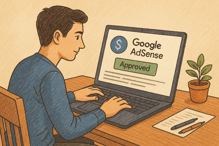
There’s a moment in every creator’s journey when you stop thinking only about traffic and start thinking about money. You’ve written the posts, your SEO is working, and people are landing on your site. Now what? For most bloggers, the first monetization step is contextual ads — the classic “plug and earn” model through AdSense, Ezoic, Mediavine, or AdThrive.
On paper, it’s straightforward. You add ads to your site, readers see them, and you get paid per impression or click. But here’s what nobody tells you early on: the real money in contextual ads doesn’t just come from traffic numbers. It comes from where you place those ads.
I’ve seen two sites with nearly identical traffic — same niche, same number of monthly pageviews — yet one earned two or three times more ad revenue. The difference wasn’t magic or luck. It was ad placement.
And here’s where it gets more interesting: desktop and mobile behave completely differently. Readers use them differently, layouts behave differently, and ad slots perform differently. Treat them the same, and you’ll leave money on the table.
So let’s dive into it: where ads really work on desktop, where they actually pay on mobile, and how to find that sweet spot where monetization meets user experience.
Why Placement Makes or Breaks Contextual Ads
When you start with contextual ads, it’s tempting to believe the myth that more ads = more money. Stick one in every corner, and surely revenue doubles, right? Wrong.
Ads have something called viewability — whether they’re actually seen by a user — and click-through rate (CTR), which is how often someone clicks. The higher those numbers, the better your RPM (revenue per thousand impressions). But if you scatter ads randomly or stuff them into dead zones, users tune them out. That’s called banner blindness, and it’s the fastest way to cut your own earnings in half.
The fix isn’t adding more ads. It’s learning where readers pay attention. And that attention changes depending on the device.
How Readers Behave: Desktop vs. Mobile
Before we get into placements, it helps to look at how people actually consume your site.
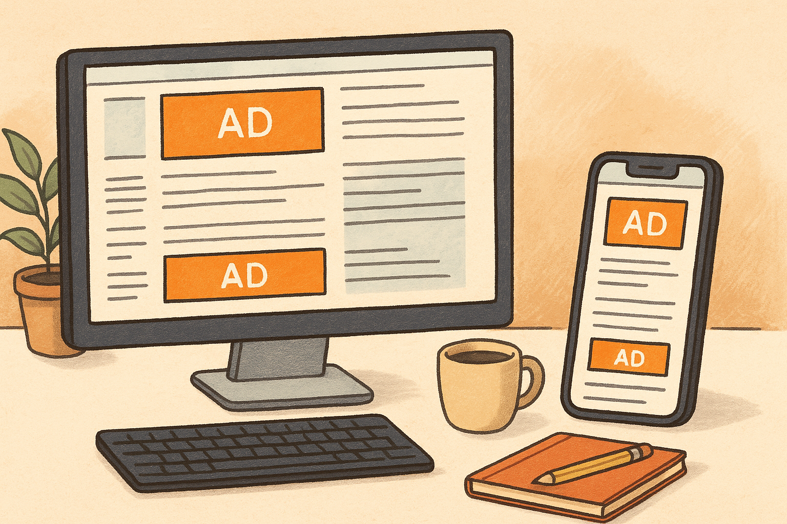
- On desktop: Readers see wider layouts. They glance at sidebars, headers, maybe even footers. Their eye movement goes left to right and up to down. They multitask, open multiple tabs, and sometimes skim sidebars for navigation.
- On mobile: It’s a straight vertical scroll. No sidebars, no “extra” space, just one column. People scroll faster, often skim through sections, and spend less time pausing unless the content really hooks them.
That’s why desktop gives you more surface area to work with, but mobile forces you to be surgical.
The Desktop Story: Where Ads Pay
On desktop, you’ve got options: sidebars, headers, in-content placements. But not all spots are equal. Let’s go through them.
The First In-Content Ad (After 2–3 Paragraphs)
This is the golden spot. Readers land on your article, they get through your hook and intro, and then — right when they’re warmed up — an ad appears. It feels natural, like part of the reading rhythm.
Too early (like above the fold before any text) feels aggressive. Too late, and readers are already scanning or skipping. Right after the 2nd or 3rd paragraph is just right.
For many publishers, this one unit alone drives a disproportionate share of revenue.
Mid-Article Placements
On longer posts, don’t stop at one. A 2,000-word post can easily support two in-content ads. A 3,500-word guide like this one? Three or four, spread naturally, makes sense.
Rule of thumb: drop an ad roughly every 500–700 words, but always check if the flow feels broken. Ads should come at natural pauses: after a section wrap-up, not mid-sentence.
Sidebar Ads
People love to dismiss sidebars as “dead zones,” but that’s only half true. On desktop, a sticky sidebar ad (one that scrolls with the reader) can deliver massive viewability.
Do people click them? Rarely. But you’re not aiming for clicks here. You’re aiming for impressions, and sticky sidebars can stack up CPM revenue.
If your theme supports it, this is a must-have.
Header Ad (Below the Nav Bar)
Every reader sees the header, which means every header ad gets an impression. Great for CPM, not for CTR. People ignore these more often than not, but networks love high-visibility slots.
Just don’t let it push your content too far down the screen. Content first, then ad.
End-of-Post Ads
Here’s the truth: most desktop readers never see them. Only your most loyal, engaged readers scroll all the way. That’s why end-of-post units are almost always low earners.
Still, they can pad your revenue because impressions add up. Just don’t expect miracles.
The Mobile Story: Where Ads Earn
Mobile is where the majority of readers are these days, and it flips the script. Sidebars disappear, layouts condense, and scrolling speeds up. Here’s what works.
The First In-Content Ad (After 2–3 Paragraphs)
Just like desktop, this is the money slot. It’s the most natural place for an ad, and it blends seamlessly into the scroll.
Sticky Bottom Ad
If there’s one placement that defines mobile earnings, it’s this one. A sticky ad sits at the bottom of the screen, visible as the reader scrolls. It doesn’t go away, which means it has near-perfect viewability.
Networks love this, advertisers pay more for it, and creators often see 20–40% boosts in RPM when sticky ads are added.
The key is not letting it overwhelm the screen. It should feel like a slim banner, not a pop-up takeover.
Second In-Content Ad (~⅔ Down the Page)
Readers scroll faster on mobile, but they do make it further down. Dropping another in-content unit lower down gives you a second bite at the apple — catching skimmers and deeper readers alike.
End-of-Post Ads
They do slightly better on mobile than desktop because people scroll down faster, but they’re still secondary. Nice to have, not essential.
Interstitials (Optional)
Interstitials are those full-screen ads that pop up between pages. They can work, but they’re risky. Overuse them, and readers vanish. Use them carefully: only after a few pageviews, not right away.
The Side-by-Side: Desktop vs. Mobile
To make it clearer, here’s the head-to-head:
- Desktop winners: first in-content ad, mid-article slots, sticky sidebar.
- Mobile winners: first in-content ad, sticky bottom, one more mid-article.
- Weakest on both: end-of-post ads.
One well-placed ad is worth three bad ones. That’s the rule of thumb.
Common Mistakes People Make
- Ad overload: Stuffing ads every few paragraphs. This doesn’t increase earnings. It just annoys readers and tanks session time.
- Bad spacing: Dropping ads mid-sentence or mid-graphic. Always place at natural breaks.
- Ignoring mobile: Optimizing for desktop only, when most traffic is mobile.
- Not testing: AdSense has Experiments, Ezoic has AI placement. Use them. Don’t assume.
Lessons From Real Publishers
I’ve seen the same patterns across niches:
- A recipe blogger moved their first ad from after the 7th paragraph to after the 3rd. RPM jumped 25%.
- A tech site overloaded with ads every 2 paras saw bounce rates soar, time-on-site collapse, and revenue drop despite “more ads.”
- A finance blog finally added sticky mobile ads and watched mobile RPM nearly double.
The lesson? Small tweaks matter. Placement is leverage.
What We’ve Seen at TodaysFunda
Here on TodaysFunda, we run long-form posts — often 2,000 to 4,000 words. That makes placements even more critical.
- The first in-content ad after 2–3 paragraphs consistently outperforms every other slot.
- Mobile sticky ads are gold. Without them, mobile revenue lags. With them, it catches up to desktop levels.
- End-of-post ads? Almost invisible. We keep them for impressions, but never rely on them.
Over time, we’ve learned that ads perform best when they flow with the reader’s natural rhythm. Placement isn’t about tricking people. It’s about being there when attention is still high.
How to Think About It
If you take nothing else from this, remember this: contextual ads don’t reward you for spamming. They reward you for understanding how people read.
- On desktop, use the extra space: sidebar, header, and mid-content.
- On mobile, lean on in-content and sticky bottom ads.
- Always test. What works for one site may not work exactly the same for another.
But the broad truth stays the same: a few thoughtful placements will almost always earn more than a wall of ads.
Smart Ideas, Straight to You
Subscribe for free updates — posts, tools, and strategies to help you create smarter and grow faster.